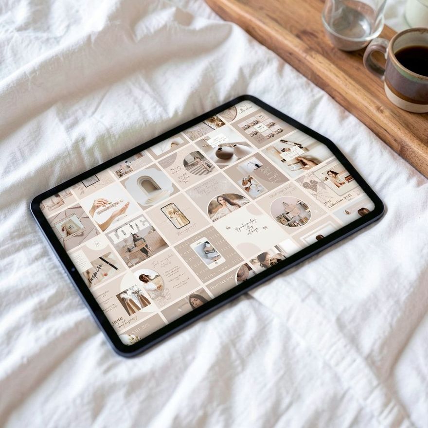
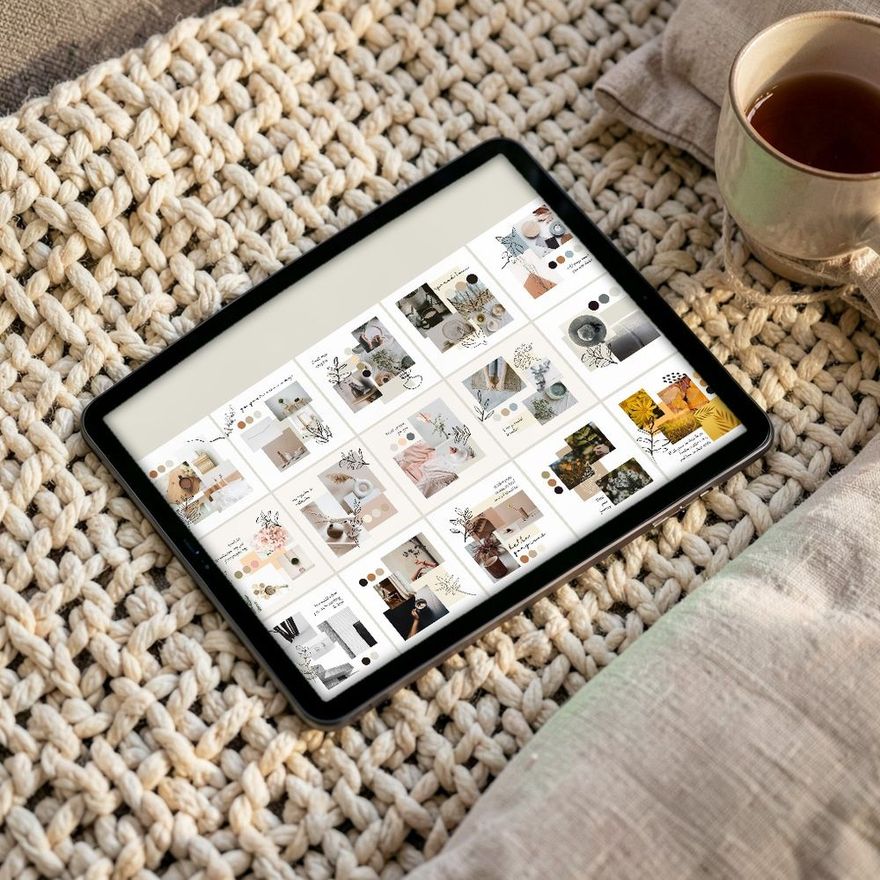
A font pairing works when the two fonts are clearly different in build and close in mood. In practice that means one font with character for the headline and one quiet, readable font for everything else. Pick the pair once, use it on every post, and your feed starts to look like it belongs to one account.
Three Rules That Cover Most Cases
Contrast, not near-matches. Pair a serif with a sans serif, or a heavy condensed font with a light open one. Two fonts that are almost alike, such as two geometric sans serifs, look like a mistake rather than a choice.
One font with personality. A display font, a script or a high-contrast serif draws attention. Two of them compete. Let one font be the voice and the other be the paper it is printed on.
Two fonts, no more. If you need a third level, such as a small label above the headline, use the body font in capitals with wider letter spacing, or a bolder weight. Weight, size and case give you all the variety a post needs.
A serif has small strokes at the ends of its letters, like the type in a printed novel. A sans serif has none. A display font is drawn for large sizes and short lines, and usually falls apart in a paragraph.
Sizes That Read on a Phone
An Instagram post is designed 1080 pixels wide. A phone screen is 360 to 440 points wide in the units apps are laid out in, so the post appears at somewhere between a third and 40 percent of the canvas size. Everything on it shrinks by the same amount, which is why text that looks generous on a laptop turns tiny in the feed.
Working numbers for a 1080-pixel-wide Canva design. They are a rule of thumb to start from, not a Canva setting:
- Headline: 70–120, depending on how many words it has.
- Subheading: 40–56.
- Body text: 30–36. Treat 28 as the floor.
- Small labels, handles, slide numbers: 22–26, in capitals or a medium weight.
Thin and script fonts need to be larger than these numbers, because their strokes vanish when scaled down. If a post has so much body text that it only fits at size 22, the fix is fewer words or a second slide, not a smaller font.

Eight Pairings
All sixteen are open-source typefaces published on Google Fonts, and all sixteen turn up in current lists of fonts in Canva's library. Canva's own font-pairing guide uses ten of them; League Spartan with Libre Baskerville is the first combination it names, and Bebas Neue with Montserrat is another. Font libraries do change. In Canva's font panel, the filter inside the search bar sorts fonts by price, so you can check what your plan includes; if a font is missing, pick a substitute of the same kind from the description.
| Headline | Body | Mood | Suits |
|---|---|---|---|
| Playfair Display | Montserrat | Editorial, polished | Beauty, fashion, quotes |
| Cormorant Garamond | Lato | Soft, refined | Wellness, weddings, skincare |
| DM Serif Display | DM Sans | Modern, friendly | Coaches, carousels, tips |
| Bebas Neue | Open Sans | Loud, direct | Fitness, announcements, sales |
| Oswald | Roboto | Compact, newsy | Lists, how-tos, schedules |
| League Spartan | Libre Baskerville | Confident with a bookish note | Brand statements, studios |
| Abril Fatface | Poppins | Bold, retro | Short headlines of two to four words |
| Raleway (bold) | Lora | Calm, warm | Longer text, personal posts |
A few notes on using them:
- Bebas Neue has capital letters only and a single weight. It is a headline font and nothing else.
- Cormorant Garamond is delicate. It comes in five weights, from Light to Bold; use it large, and choose Medium, SemiBold or Bold if it sits on a photo.
- DM Serif Display has one weight, with an italic. As the name says, it is drawn for display sizes, so leave the body text to DM Sans.
- Abril Fatface has extreme thick and thin strokes and only one weight. Give it a plain background and few words.
- Montserrat, Poppins, Raleway and Roboto each run from Thin to Black, nine weights in all, so one family can supply a label, a subheading and body text.
- Raleway and Lora reverse the usual order, with a sans serif headline and a serif body. That works well when the body text is longer, since a text serif is comfortable to read in paragraphs.
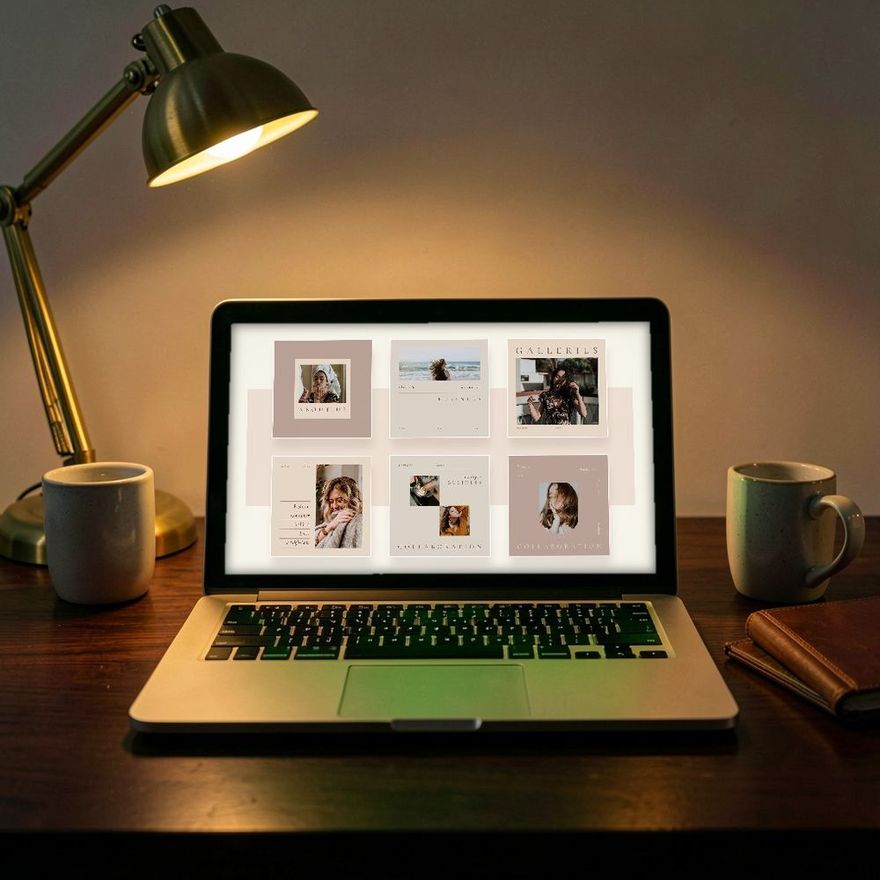
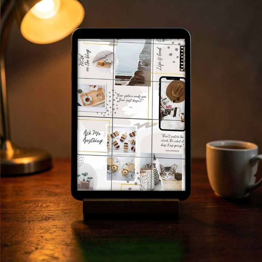
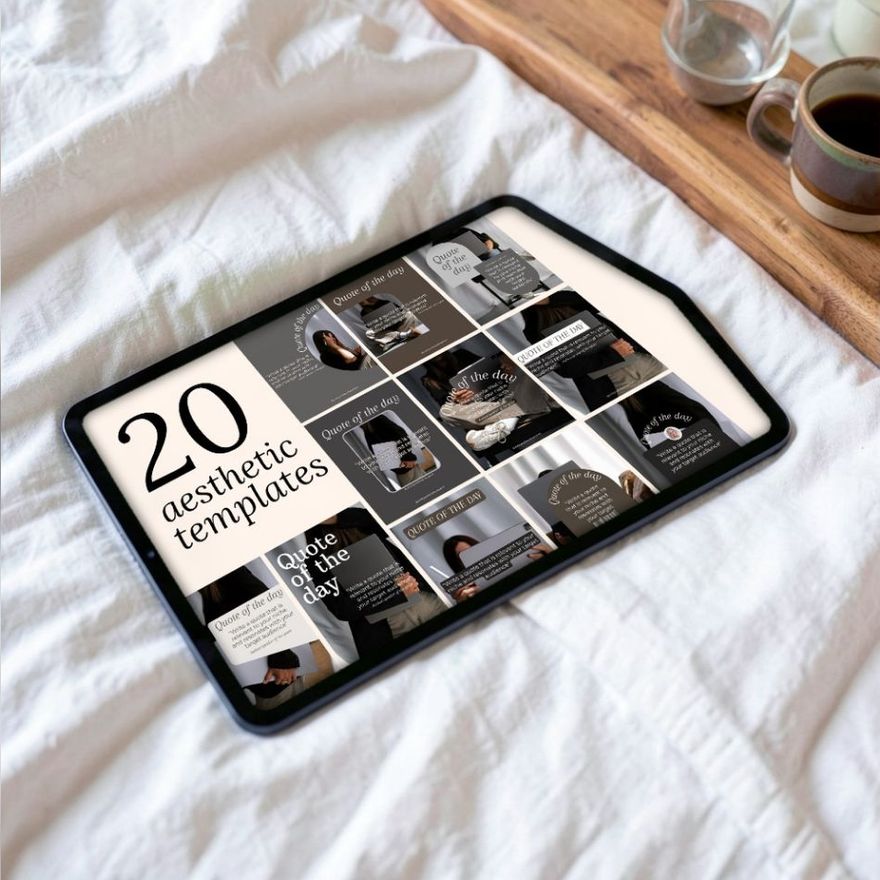
Type-led templates are where a pairing shows most, because there is little on the page besides the letters. Quote and minimalist sets are a good place to try a new pair before you roll it out everywhere.
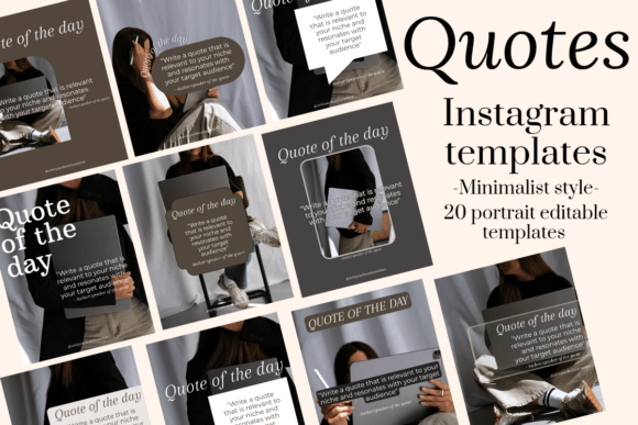
Minimalist Instagram Quotes Templates
See the listing ↗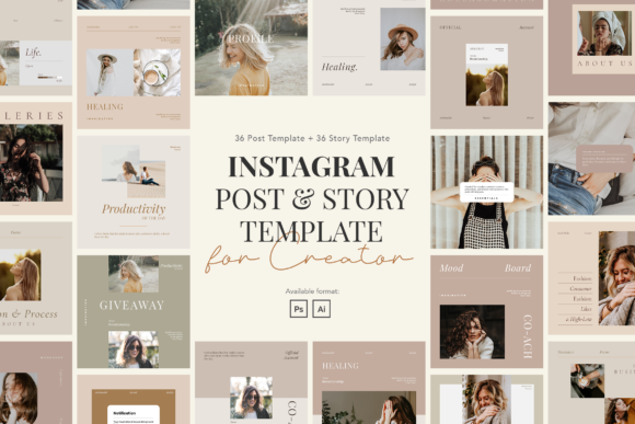
Minimalist Instagram Post & Story
See the listing ↗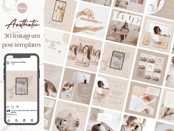
Aesthetic Instagram Brand Post Templates
See the listing ↗From the collection Aesthetic & Minimalist Instagram Templates. New Creative Fabrica members get 10 free downloads, and any of these can be one of them.
If You Want a Script Font
Handwritten and script fonts are popular in beauty, wedding and lifestyle niches, and they are the easiest fonts to misuse.
- Use a script for one to three words, never for a sentence.
- Never set a script in all capitals. The joined letters are drawn for lowercase and become unreadable.
- Make it larger than you think it needs to be. Check it on a phone.
- Pair it with a plain sans serif such as Montserrat or Lato, so the script is the only decoration on the page.
A common, safe structure is one word in script ("hello", "new", "thank you") and the rest of the headline in a clean sans serif.
Applying a Pairing to a Template
Templates come with the designer's fonts. Swapping them for yours takes a few minutes if you do it in order.
- Change the headline font on one page and adjust the size until it fills the same space. Fonts differ in width: a condensed font like Oswald takes far less room than Playfair Display at the same size.
- Change the body font and check that paragraphs still fit their boxes.
- Apply the same two fonts to the remaining pages. Canva tutorials show a "Change all" button at the bottom of the font panel that swaps a font throughout the design once you change it in one place. The Help Center does not document it; if you do not see it, select the text you have already restyled and use the Format painter to copy its style to the next text box.
- Look at every page for broken line breaks, since new fonts wrap differently.
The rest of the editing process, including colors and export, is in the guide to editing a Canva template. If you post multi-slide content, keep the same two fonts on every slide; consistency across slides is one of the points in our carousel structure guide.
Quote bundles and plain, general-purpose sets are the easiest to restyle, because the words are the main event and little else in the design depends on the original typeface.
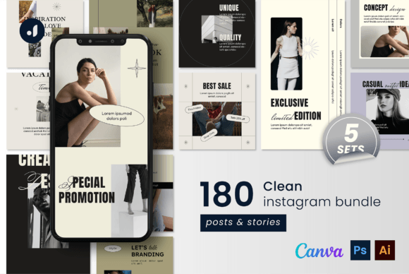
Clean Instagram Bundle
See the listing ↗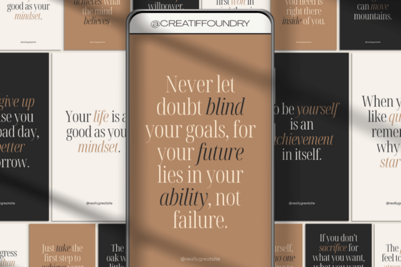
120 Mindset Quotes Instagram Bundle
See the listing ↗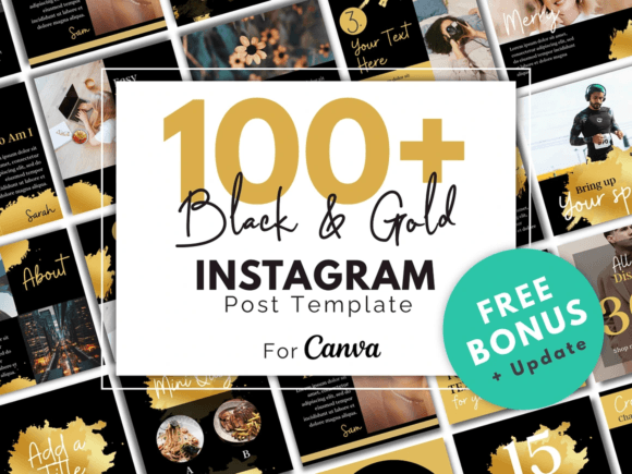
Gold Canva Social Media Template
See the listing ↗From the collection Canva Instagram Templates. New Creative Fabrica members get 10 free downloads, and any of these can be one of them.
Spacing: The Other Half of Readability
Font choice gets the attention, but spacing decides whether text is comfortable to read. In Canva, select the text, open Advanced Settings on the toolbar, and adjust the line spacing and letter spacing sliders under Spacing.
- Line spacing for headlines: tight, around 1.0 to 1.2, so a two-line headline reads as one unit.
- Line spacing for body text: looser, around 1.3 to 1.5.
- Letter spacing for capitals: open it up a little. Capitals set tight look cramped, especially at small sizes.
- Letter spacing for scripts: leave it at zero, or the joins between letters break.
- Margins: keep text well away from the edges. The profile grid crops posts, as explained in the guide to Instagram post sizes.
Common Mistakes
- Three or four fonts on one post. It reads as clutter. Go back to two.
- Thin fonts over photos. Light weights disappear against a busy image. Use a bolder weight or put a solid shape behind the text.
- Long text centered. Centering suits a headline or a short quote. Paragraphs are easier to read aligned left.
- Low contrast. Pale gray on white or pink on peach looks gentle on a monitor and unreadable outdoors on a phone.
- A different pairing every week. Recognition comes from repetition. Change the photo and the words, not the typefaces.
- A font that only you have. Uploading your own font files to Canva is a Brand Kit feature of the paid plans. On a free account, choose from the library.
Before you commit to a pair, make one test post with a headline, two lines of body text and a small label. Download it, send it to your phone and look at it at arm's length. If you can read all three levels, the pair works.
Choose One and Stay With It
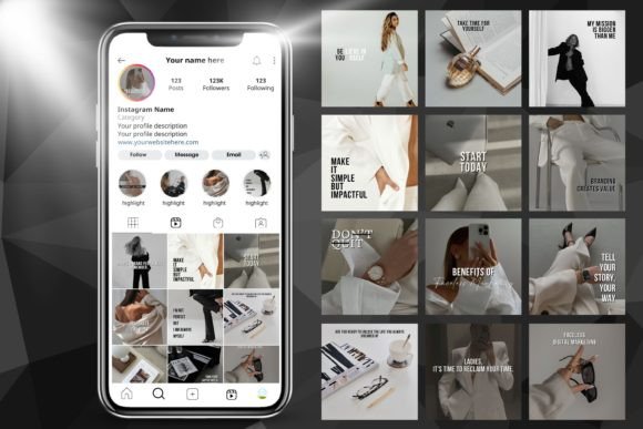
Pick the row in the table that is closest to your brand's mood, set it up on one template, and write the two font names in a note along with your color codes. Then use that pair for a month before judging it. The aesthetic and minimalist templates collection is a good testing ground, since the layouts are simple enough that the fonts do most of the talking.
Collections That Fit This Article
 Aesthetic & Minimalist Instagram Templates8 hand-picked · open the collection →
 Canva Instagram Templates8 hand-picked · open the collection →