
A carousel that gets read to the last slide does five jobs in order. The first slide names one specific payoff. The second says who it is for or why it matters. The middle slides deliver one point each. Then comes a recap worth saving, and a final slide that asks for one thing. Most weak carousels skip the second job or cram three points onto every slide.
The Five-Part Structure
| Slide | Job | What goes on it |
|---|---|---|
| 1 | Hook | A headline of 6–10 words that promises something concrete |
| 2 | Context | The problem, who this is for, or what they will have by the end |
| 3 to second-to-last | Points | One step, tip or example per slide |
| Second-to-last | Recap | All the points on one slide, as a short list |
| Last | Call to action | One request: save, share, comment or visit |
For a seven-slide carousel that means a hook, a context slide, three points, a recap and a call to action. For ten slides you get six points. The outer four slides stay the same; only the middle grows.
The hard limits come from Instagram's Help Center: one carousel holds up to 20 photos and videos, it has one caption and one location for the whole post, and every slide takes the same orientation.
Slide 1: The Hook
The first slide is the one shown on your profile, cropped to the 3:4 thumbnail of the grid, and usually the one people meet in the feed, so it has to work alone. Treat it as a title, not a cover.
Specific beats clever. "5 Mistakes That Make Curly Hair Frizz" tells the reader exactly what is inside. "Let's Talk Hair" does not. Useful hook shapes:
- A number and a result: "4 Stretches for a Stiff Neck"
- A mistake: "Why Your Sourdough Is Dense"
- A how-to: "How to Price a Custom Cake"
- A comparison: "Gel vs. Acrylic: Which Lasts Longer"
- A checklist: "What to Bring to Your First Yoga Class"
Set the headline large and keep the slide nearly empty apart from it. Then give the reader a reason to swipe: a small arrow, the word "swipe", or a shape that runs off the right edge and continues on slide two.
The Middle: One Idea per Slide
Each middle slide needs a short heading and one to three lines under it. If a slide holds more than about 40 words, split it in two. People read carousels at swiping speed, and a wall of text is where they stop.
Number the slides or the points. A "3/5" in the corner tells the reader how much is left, which makes finishing feel close. Keep the heading in the same spot on every slide so the eye lands there without searching.
Order matters as well. Steps go in the order you do them. Tips go strongest first, because not everyone reaches slide six.
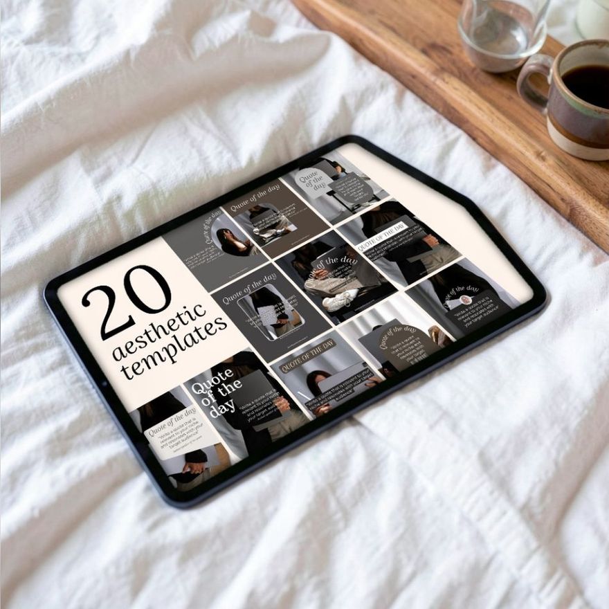
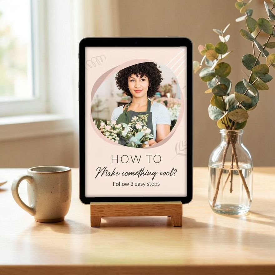
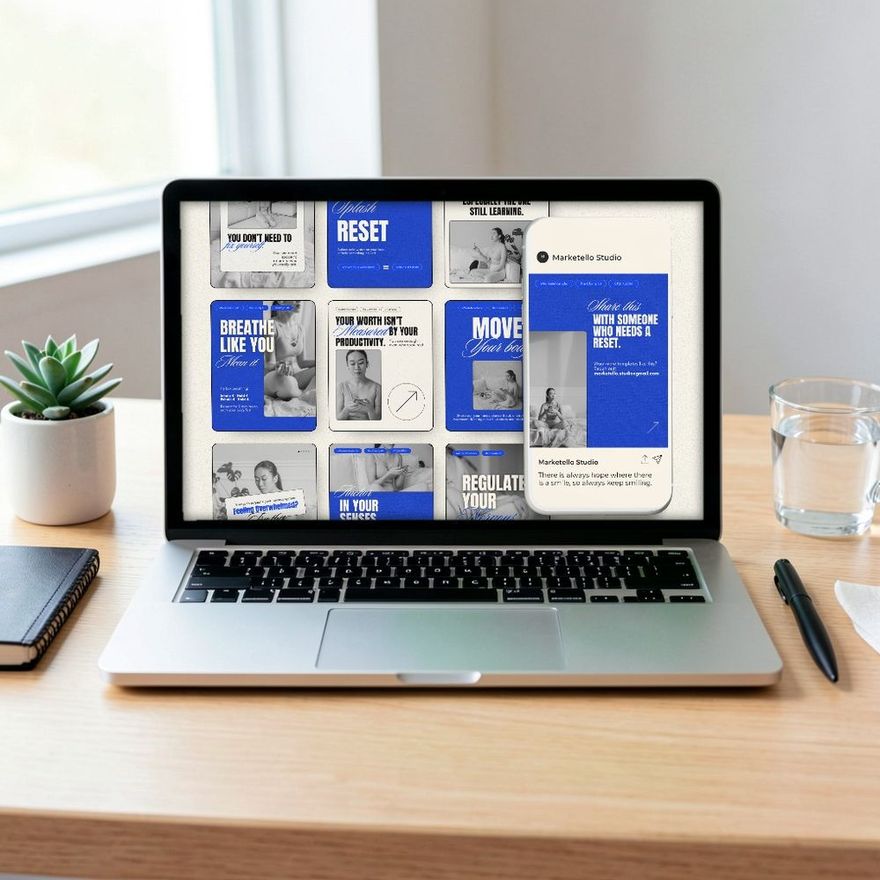
The three sets below are named for exactly these teaching formats: a step-by-step carousel, one for coaches and one for creators.
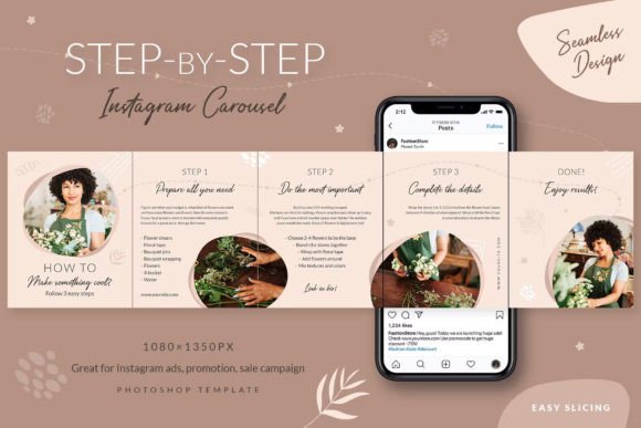
Step-by-step Instagram Carousel
See the listing ↗
Instagram Carousel Post for Coaches
See the listing ↗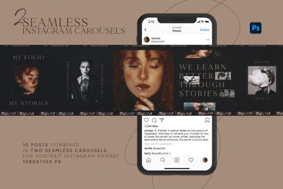
Instagram Carousel for Creators
See the listing ↗From the collection Instagram Carousel Templates. New Creative Fabrica members get 10 free downloads, and any of these can be one of them.
The Recap and the Last Slide
The recap is the slide people save. Put every point on it in a few words each, so that someone who returns in a month can use the slide without swiping through the rest.
The last slide asks for one thing, and the request should match the content. A checklist earns "save this for later". An opinion earns "tell me if you disagree". A service explanation earns "message me to book". Three requests on one slide usually get none of them.
The caption can repeat that single request in words. The formula for it is in our guide to writing Instagram captions.
Seven Carousel Types With Example Topics
When you are stuck, pick a type first and a topic second.
- How-to. Steps in order. A florist: "How to Make Supermarket Flowers Last a Week."
- Checklist. Things to gather or confirm. A photographer: "What to Wear for Family Photos."
- Before and after. Slide one shows the result, the next slides show the start and what changed. A salon: one color correction, start to finish.
- Myths and facts. One myth per slide, each followed by the correction. A personal trainer: "3 Things You Have Heard About Lifting That Are Not True."
- Mini case. One real client or project: the situation, what you did, what happened. Get permission before you share someone's story, and report only what actually happened.
- List of ideas or tools. A bookshop: "6 Short Novels for a Long Weekend."
- Photo story. A sequence of images with one line of text each: a market day, a workshop, an order being made.
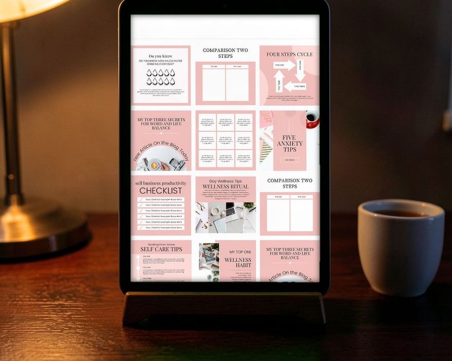
The first six are text-led and suit a graphic template. The seventh is photo-led and needs frames more than text boxes. Going by the names, the first set below is styled after instant-photo prints, the second is made for one trade, and the third is a general-purpose set.
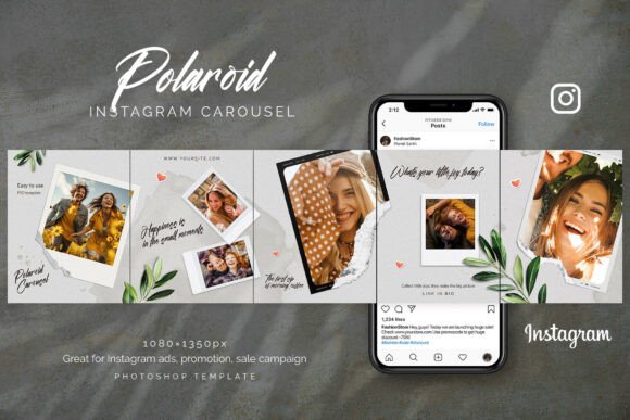
Polaroid Instagram Carousel
See the listing ↗
Skincare Instagram Carousel Canva Post
See the listing ↗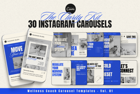
Instagram Carousel Templates-Clarity
See the listing ↗From the collection Instagram Carousel Templates. New Creative Fabrica members get 10 free downloads, and any of these can be one of them.
If you run out of topics rather than formats, the five pillars in our guide to content ideas for small business each produce a carousel or two.
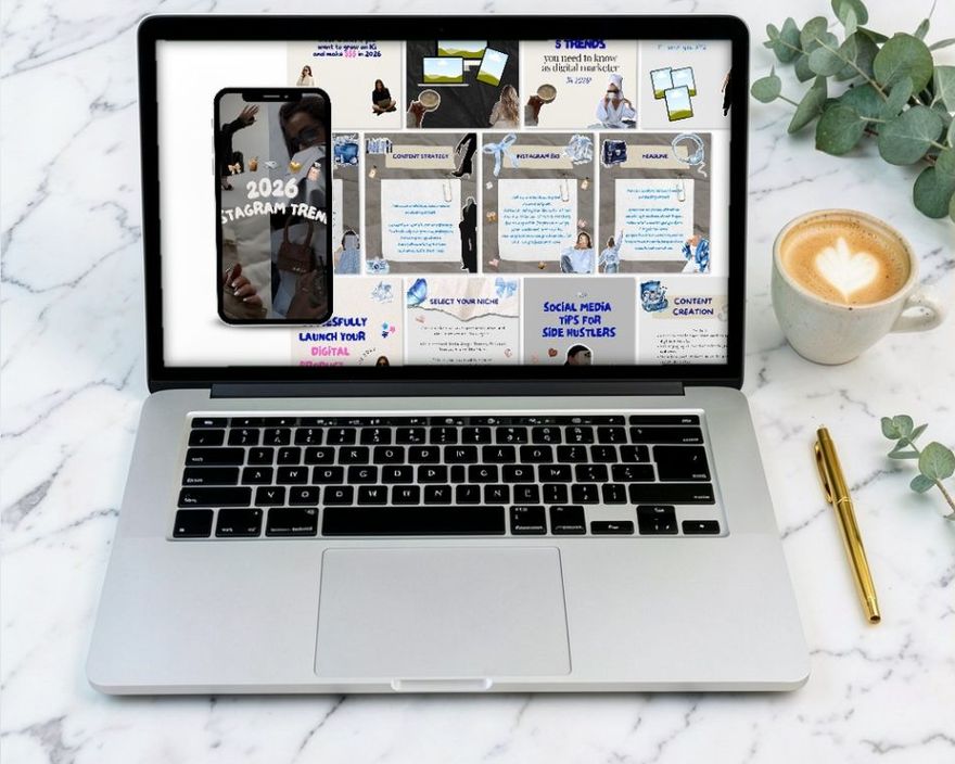
Keeping the Design Consistent Across Slides
A carousel should look like one object, not seven posts.
- One canvas size. Use 1080 x 1350 for every slide, or 1080 x 1440 if you want the first slide to fill its profile thumbnail edge to edge. Instagram applies one orientation to the whole post, so mixed shapes get cropped; the details are in the guide to Instagram post sizes.
- One grid. Same margins, same heading position, same place for the slide number.
- Two fonts. One for headings, one for body text. Vary weight and size, not typeface.
- A limited palette. Two or three colors. You can alternate a light and a dark background from slide to slide for rhythm, as long as the colors stay within the palette.
- Something that travels. A line, a ribbon or a photo that crosses the edge of one slide and continues on the next ties the set together and nudges the swipe.
The first and last slides can break the pattern slightly, with a bigger headline or a full photo. The middle slides should look like siblings.
Design slide three first. It is the typical slide, and once it works you can duplicate it for every point. The hook and the closing slide are then variations of a layout you already trust.
How Many Slides
Let the content decide. The maximum is 20 slides; it was 10 until August 2024, and it is well above what most ideas need. Five to ten slides cover nearly every topic.
One practical catch: the limit is lower outside the app. Meta's own Business Suite notes that a post to Instagram can carry 10 photos, so a carousel you plan to schedule from a computer should stay at ten slides or fewer.
A quick test: write your points as a plain list first. If you have three points, that is a seven-slide carousel. If you have eleven, you probably have two carousels, or four points that deserve the space and seven that do not.
Build Your First One
- Choose a type from the list above and write the hook as a headline.
- Write the points as a plain list, one line each.
- Write the recap by shortening each point to a few words.
- Decide on the single request for the last slide.
- Open a template from the Instagram carousel templates collection, set your fonts and colors on one middle slide, and duplicate it for each point.
- Export the pages as separate images and upload them in order.
After the carousel is published you can still change the order of the slides, remove one, or edit the caption through the post's three-dot menu and Edit. What you cannot do is add a slide, so check the set before you share it.
Writing the words before opening the design tool is the part that saves time. A carousel with clear points is quick to lay out. One without them can take all evening and still not read well.
Collections That Fit This Article
Instagram Carousel Templates8 hand-picked · open the collection →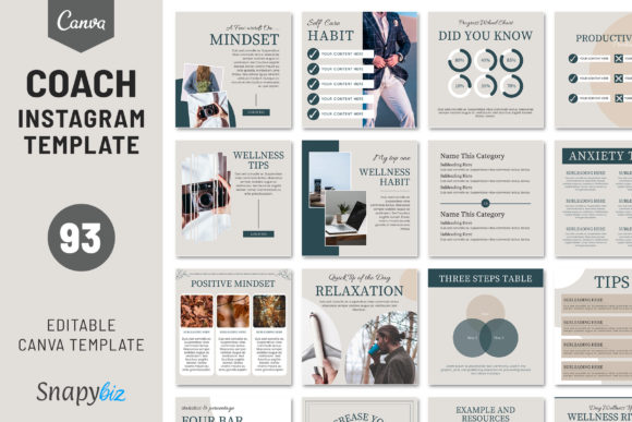 Fitness & Coach Instagram Templates8 hand-picked · open the collection →